
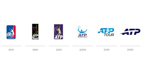
The ATP has revealed the latest evolution of its iconic logo – the sixth in its 54-year history.
From the tour, via email:
Simplified and reimagined for the digital age, the new logo enhances versatility across platforms and products – from broadcast and social media to merchandise and tournament branding. The refreshed mark is designed to telegraph the energy of the sport, featuring a curved trajectory that reflects the motion of a tennis ball in play.
Below see the evolution of the ATP’s logo over the last five-plus decades.
0 comments