By Alberto Amalfi
(October 24, 2010) The WTA Tour has applied a new Brand Aid. The WTA launched a new logo that both modernizes and simplifies the brand's mark, incorporating an oval shape to recall a racquet and a yellow ball in the logo. The re-branding presents a much sleeker logo than the previous "Sony Ericsson WTA Tour" logo and underscores the absence of a title sponsor for the Tour.
The new mark is "designed to serve as a distinctive and modern reminder of the captivating athleticism and excitement," of women's tennis, the Tour announced.
"For close to four decades the WTA brand has stood for premium athleticism and entertainment on a global stage,” said Stacey Allaster, Chairman and CEO of the WTA. "The WTA identity unveiled today is intended to be a modernized presentation of our logo that is both functional and effective for our partners and members across all forms of media."
To create its new logo, the WTA enlisted Chermayeff & Geismar, a leading global brand design firm behind many of the world’s most recognizable trademarks including Chase, Mobil, NBC, PBS, Armani Exchange, National Geographic, and Barney’s New York, among others.
The firm opted against using an athlete's silhouette in the logo. Athletic images are part of the ATP and NBA logos.
"By diverging from the expected approach of featuring an image of an athlete, we created a mark that is unusual in professional sports, and its appropriately bold identity will over time come to recall the incredible athletes that represent women’s tennis, said Chermayeff & Geismar Partner and designer Tom Geismar.
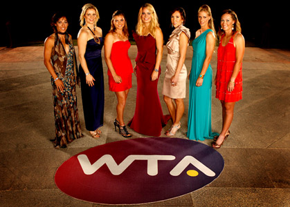
The design of the new brand image departs from conventional sport logos by not featuring a figure of a female tennis player, but rather putting the emphasis on the letters W, T, and A. The symbol also incorporates subtle references to the sport: the oval shape of the mark is a reference to both the imprint a tennis ball leaves on the court and to the shape of a racquet, while the yellow circle as the crossbar of the “A” recalls a tennis ball. The new core brand identity will be fully integrated throughout the WTA and women’s tennis, including in television graphics, print materials, tournament branding, advertising, promotion, and digital and social media in all its forms throughout the 2011 season.
"I think that this is a very exciting time for the WTA with great new sponsors and now the very cool and fresh look and feel for women’s tennis," said World No.1 Caroline Wozniacki. "I am so proud to be a part of this time for the sport and the players will definitely have a greater connection to the fans through the new brand."
Earlier this year, Sony Ericsson, the WTA’s title sponsor since 2005, renewed its partnership with the sport in the role of lead global sponsor in lieu of title sponsor, providing women’s tennis the opportunity to reestablish its core identity. During the course of 2010, the WTA has renewed both Sony Ericsson and Travelex and signed new partnerships with Oriflame, a Swedish cosmetics company and Peak, a Chinese apparel brand.